
Whippet Breed Council website
The Whippet Breed Council (WBC) was set up in 1984 to act as a conduit for the Breed Clubs to work together, liaise with each other and collaborate with The Kennel Club

The Whippet Breed Council (WBC) was set up in 1984 to act as a conduit for the Breed Clubs to work together, liaise with each other and collaborate with The Kennel Club
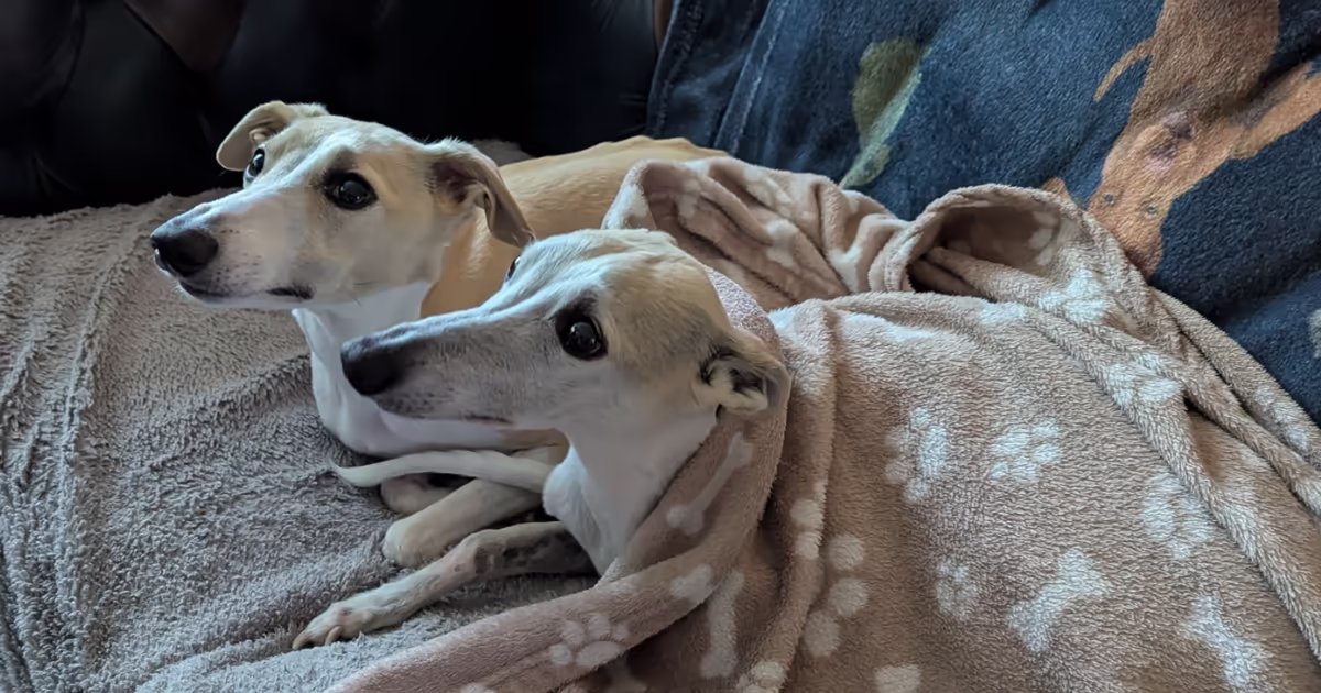
You may know, if you’ve read our ‘About’ page, that we are the proud guardians of two beautiful whippets.

Eventage is a leading professional conference and event management company dedicated to the healthcare sector.

The International Thoracic Oncology Nursing Forum (ITONF) is an international organisation for those who are directly caring for people with lung cancer or mesothelioma in a nursing role.

The annual book of poetry from the Forward Arts Foundation, The Forward Book of Poetry 2025 has now been released and it was our pleasure again, to design the epub version of the book. As written about in other previous posts on the yearly Forward ebook, making poetry work properly in epub is always something … Read more

JR Whippet Rescue is a breed specific fostering and rehoming network. Ninja Beaver is the web designer and manager of their online content.
With Deadpool & Wolverine giving the MCU the rocket-fuel it desperately needed; it’s fascinating to read about the behind-the-scenes shenanigans over the creation of Wolverine.

I recently had an opportunity to collaborate with someone I used to work with in the games industry.

In 2022, we were approached by the online learning course BBC Maestro to help create epub versions of their courses.

The Forward Book of Poetry 2024 is the latest edition of poetry from the Forward Arts Foundation


To source illustration through an agent, Sarah can be hired through the illustrators agency